The vast majority of us carry a little GPS device in our pockets all day long, quietly recording our location. But location is more than just latitude and longitude; it can tell us about our speed, our direction, our activities, and frankly our lives. Some people regard this as terrifying, but I see a wonderful dataset.
Initially, I didn't have much of a drive to fiddle with my own location history. What could I really do that Google Latitude couldn't already? But after Latitude's demise in 2013, I entered full fiddle-around mode, and quickly discovered the incredible array of tools that Python puts at your disposal to easily and beautifully manipulate geospatial data.
This blog post focuses on how to analyze your location history data and produce some cool maps to visualize how you spend your time. Of course, there are 1,000,001 more ways to utilize location history, but hopefully this post gives you the tools to pursue those other ideas.
If you're not interested in the learning the code to make these graphs but know me personally, stick around. You might even learn a thing or two about me.
To follow this post, you'll need a bunch of Python packages.
And of course, all this code will be executed using IPython, my best friend. Here's my import list for this tutorial.
import matplotlib.pyplot as plt
import numpy as np
import pandas as pd
from mpl_toolkits.basemap import Basemap
from shapely.geometry import Point, Polygon, MultiPoint, MultiPolygon
from shapely.prepared import prep
import fiona
from matplotlib.collections import PatchCollection
from descartes import PolygonPatch
import json
import datetime
Downloading your Google location history
If you've previously enabled Google location reporting on your smartphone, your GPS data will be periodically uploaded to Google's servers.1 The decisions of when and how to upload this data are entirely obfuscated to the end user, but as you'll see below, Android appears to upload a GPS location every 60 seconds, at least in my case. That's plenty of data to work with.
Google provides a service called Takeout that allows us to export any personal Google data. How kind! We'll use Takeout to download our raw location history as a one-time snapshot. Since Latitude was retired, no API exists to access location history in real-time.2 Here's what to do:
- Go to https://www.google.com/settings/takeout. Uncheck all services except "Location History"
- The data will be in a json format, which works great for us. Download it in your favorite compression type.
- When Google has finished creating your archive, you'll get an email notification and a link to download.
- Download and unzip the file, and you should be looking at a LocationHistory.json file.
Working with location data in Pandas
Pandas is an incredibly powerful tool that simplifies working with complex datatypes and performing statistical analysis in the style of R. Because of its flexible structure, I find myself spending a fraction of the time coding the same solution as compared to pure Python.3 Find a great primer on using Pandas here. We won't be going too in depth.
So, you've installed Pandas. Let's get started! We'll read in the LocationHistory.json file from Google Takeout and create a DataFrame.
with open('LocationHistory.json', 'r') as fh:
    raw = json.loads(fh.read())

ld = pd.DataFrame(raw['locations'])
del raw #free up some memory
# convert to typical units
ld['latitudeE7'] = ld['latitudeE7']/float(1e7)
ld['longitudeE7'] = ld['longitudeE7']/float(1e7)
ld['timestampMs'] = ld['timestampMs'].map(lambda x: float(x)/1000) #to seconds
ld['datetime'] = ld.timestampMs.map(datetime.datetime.fromtimestamp)
# Rename fields based on the conversions we just did
ld.rename(columns={'latitudeE7':'latitude', 'longitudeE7':'longitude', 'timestampMs':'timestamp'}, inplace=True)
ld = ld[ld.accuracy < 1000] #Ignore locations with accuracy estimates over 1000m
ld.reset_index(drop=True, inplace=True)
Now you've got a Pandas DataFrame called ld containing all your location history and related info. We've got latitude, longitude, and a timestamp (obviously), but also accuracy, activitys [sic], altitude, heading. Google is clearly trying to do some complex backend analysis of your location history to infer what you're up to and where you're going (and you'll see some of these fields in use if you use Google Now on your smartphone). But all we'll need is latitude, longitude, and time.
Working with Shapefiles in Python
The more I learn about mapping, the more I realize how complex it is. But to do what we want to do with our location history, we're going to have to become experts in mapping in a couple hours. We don't have time to learn proprietary GIS software or write our own methods to analyze map data. But Python being Python, we've already got packages to knock this stuff out.
Shapefile is a widely-used data format for describing points, lines, and polygons. To work with shapefiles, Python gives us Shapely.4 Shapely rocks. To briefly read/write shapefiles, we'll use Fiona.
To learn Shapely and write this blog post, I leaned heavily on an article from sensitivecities.com. Please, go pester that guy to write more stuff. Tom MacWright also wrote a great overview of the tools we'll be using.
First up, you'll need to download shapefile data for the part of the world you're interested in plotting. I wanted to focus on my current home of Seattle, which like many cities provides city shapefile map data for free. It's even broken into city neighborhoods! The US Census Bureau provides a ton of national shapefiles here. Your city likely provides this kind of data too.
Next, we'll need to import the Shapefile data we downloaded, which is easy as pie.
shapefilename = 'data/Neighborhoods/WGS84/Neighborhoods'
shp = fiona.open(shapefilename+'.shp')
coords = shp.bounds
shp.close()

w, h = coords[2] - coords[0], coords[3] - coords[1]
extra = 0.01
Now we'll leverage Basemap to go about actually plotting our shapefiles.
m = Basemap(
    projection='tmerc', ellps='WGS84',
    lon_0=np.mean([coords[0], coords[2]]),
    lat_0=np.mean([coords[1], coords[3]]),
    llcrnrlon=coords[0] - extra * w,
    llcrnrlat=coords[1] - (extra * h),
    urcrnrlon=coords[2] + extra * w,
    urcrnrlat=coords[3] + (extra * h),
    resolution='i',  suppress_ticks=True)

_out = m.readshapefile(shapefilename, name='seattle', drawbounds=False, color='none', zorder=2)
We'll need the above Basemap object m for both of the following maps.
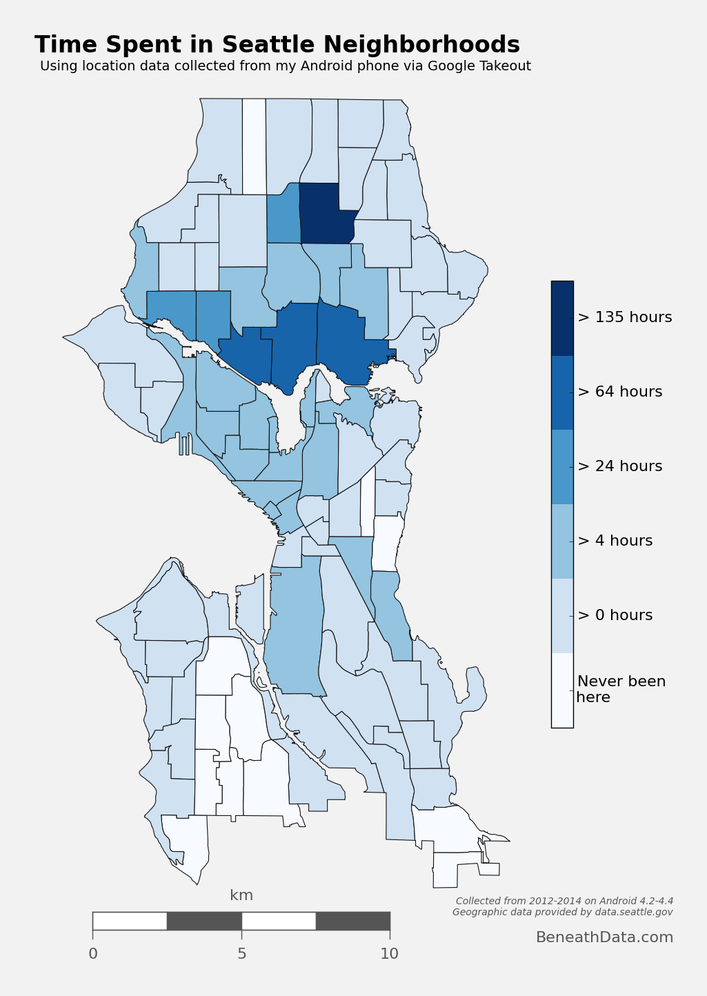
Choropleth Map
A choropleth map "provides an easy way to visualize how a measurement varies across a geographic area."5. You've seen them a thousand times, usually whenever population or presidential elections are discussed, as in this example.
I wanted to produce a choropleth map of my own location history, but instead of breaking it down by country or state, I wanted to use the neighborhoods of Seattle.
Step 1: Prep data and pare down locations
The first step is to pare down your location history to only contain points within the map's borders.
# set up a map dataframe
df_map = pd.DataFrame({
    'poly': [Polygon(hood_points) for hood_points in m.seattle],
    'name': [hood['S_HOOD'] for hood in m.seattle_info]
})
# Convert our latitude and longitude into Basemap cartesian map coordinates
mapped_points = [Point(m(mapped_x, mapped_y)) for mapped_x, mapped_y in zip(ld['longitude'],
            ld['latitude'])]
all_points = MultiPoint(mapped_points)
# Use prep to optimize polygons for faster computation
hood_polygons = prep(MultiPolygon(list(df_map['poly'].values)))
# Filter out the points that do not fall within the map we're making
city_points = filter(hood_polygons.contains, all_points)
Now, city_points contains a list of all points that fall within the map and hood_polygons is a collection of polygons representing, in my case, each neighborhood in Seattle.
Step 2: Compute your measurement metric
The raw data for my choropleth should be "number of points in each neighborhood." With Pandas, again, it's easy. (Warning - depending on the size of the city_points array, this could take a few minutes.)
def num_of_contained_points(apolygon, city_points):
    return int(len(filter(prep(apolygon).contains, city_points)))

df_map['hood_count'] = df_map['poly'].apply(num_of_contained_points, args=(city_points,))
df_map['hood_hours'] = df_map.hood_count/60.0
So now, df_map.hood_count contains a count of the number of gps points located within each neighborhood. But what do those counts really mean? It's not very meaningful knowing that I spent 2,500 "datapoints" in Capitol Hill, except to compare against other neighborhoods. And we could do that. Or we could convert hood_count into time...
Turns out, that's really easy, for one simple reason. From investigating my location history, it seems that unless my phone is off or without reception, Android reports my location exactly every 60 seconds. Not usually 60 seconds, not sometimes 74 seconds, 60 seconds. It's been true on Android 4.2-4.4, and using a Samsung S3 and my current Nexus 5. Hopefully that means it holds true for you, too.6 So if we make the assumption that I keep my phone on 24/7 (true) and I have city-wide cellular reception (also true), then all we need to do is hood_count/60.0, as shown above, and now we're talking in hours instead of datapoints7.
Step 3: Plot the choropleth
We've got our location data. We've got our shapefiles in order. All that's left - plot! Note that I've removed location data near my work and home, partly so they don't skew the colormap, and partly to anonymize my data just an eensy bit.
This plotting code for the choropleth gets a bit wordy for a blog format, so check the code as a Gist at the below link.
See The Code
Hexbin Map
We can also take a different approach to choropleths, and instead of using each neighborhood polygon as a bin, let Basemap generate uniform hexagonal bins for us! It's a great way to visualize point density, as all our bins will be of equal size. Best of all, it requires essentially no extra work as we've already defined our neighborhood Patches and paired down our location data. See the code below in the Gist.
See The Code
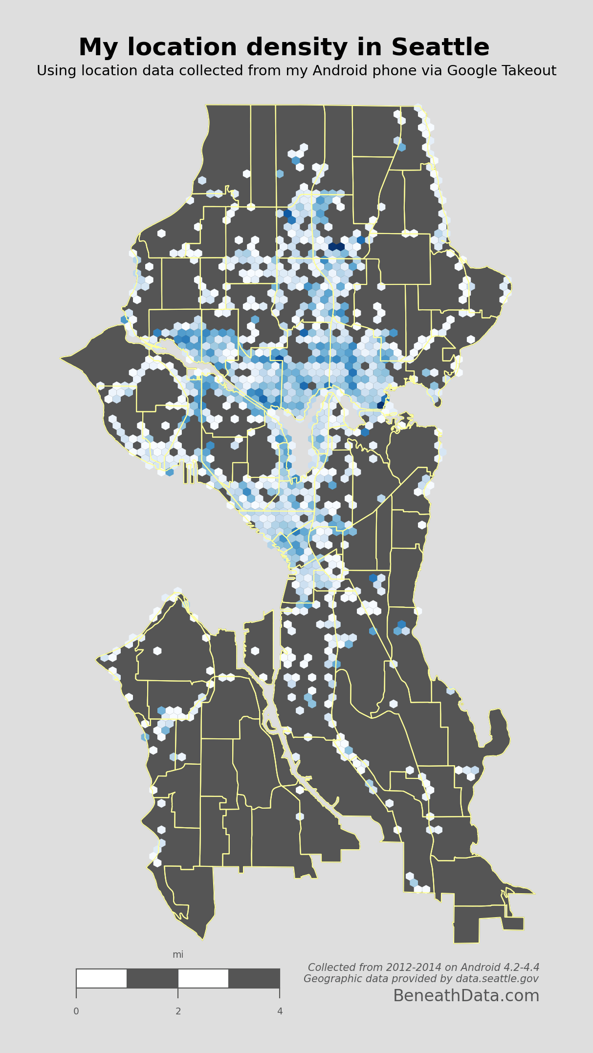
Some super interesting patterns pop out immediately. I pretty much just hang out in North Seattle and Downtown. You can quickly spot my time on the Burke-Gilman trail on the east side, and you can also spot some of my favorite hangouts. Some of my friends may even see their houses on here (remember I've removed location data from near my work and home).
Of course, I don't always have my phone with me, and I notice some glaring vacancies on the map where I know I've been like Discovery Park, Madison, West Seattle, Seward Park, etc. But all in all, pretty awesome graph.
Map of Flights Taken
If you haven't already figured it out, I really liked Google Latitude. One thing Latitude attempted was to track all your instances of flights. I'd say their algorithm caught about 90% of the flights I took, but it never gave me the ability to visualize them on a map. Always bummed me out!
But now, armed with our raw location data and Pandas, we should be able to meet and even exceed Latitude's attempts to identify flights. The basic algorithm seems pretty simple - "if speed is greater than ~300kph, you're flying" because honestly, when else are you going that fast? But there are problems with that approach:
- GPS location can be inaccurate. Take a peek at the
accuracyfield in your Data Frame. Not always spot-on. We could filter out inaccurate data points, but GPS doesn't have to be that far off to break our criteria. Think about it - if we're sampling location once per minute then all it would take is to be off by 200kph/60min or 3.3 km (~2 miles) and your algorithm would think you were flying! Looking through my location history, this happens a few times per week. So we'll have to address this concern in the algo. - Your phone collects GPS data mid-flight. This one caught me off guard. When I fly, I activate "airplane mode" which, as far as I could tell, deactivated wifi/cellular data/GPS. Turns out? It only deactivates the first two. Consequently, during a given flight, my phone will occasionally collect an (accurate!) location in mid-flight. If we're not careful, our algorithm could interpret each of these datapoints as a layover, and break our single flight into many small ones. That's no good.
- Using speed assumes no delays. Sometimes, I may turn off my phone for a flight only to sit on the tarmac for 2 hours. Or, the flight may be in a holding pattern before landing. Either scenario would dramatically decrease my computed "speed" by artificially increasing the time between airplane-mode
onandoffdatapoints.
We need something quick and dirty that can address these concerns.
First, we'll compute distance and speed between each GPS point, and create a new DataFrame to hold those values:
degrees_to_radians = np.pi/180.0
ld['phi'] = (90.0 - ld.latitude) * degrees_to_radians
ld['theta'] = ld.longitude * degrees_to_radians
# Compute distance between two GPS points on a unit sphere
ld['distance'] = np.arccos(
    np.sin(ld.phi)*np.sin(ld.phi.shift(-1)) * np.cos(ld.theta - ld.theta.shift(-1)) +
    np.cos(ld.phi)*np.cos(ld.phi.shift(-1))
    ) * 6378.100 # radius of earth in km

ld['speed'] = ld.distance/(ld.timestamp - ld.timestamp.shift(-1))*3600 #km/hr

# Make a new dataframe containing the difference in location between each pair of points.
# Any one of these pairs is a potential flight
flightdata = pd.DataFrame(data={'endlat':ld.latitude,
                             'endlon':ld.longitude,
                             'enddatetime':ld.datetime,
                             'distance':ld.distance,
                             'speed':ld.speed,
                             'startlat':ld.shift(-1).latitude,
                             'startlon':ld.shift(-1).longitude,
                             'startdatetime':ld.shift(-1).datetime,
                             }
                       ).reset_index(drop=True)
Now flightdata contains a comparison of each adjacent GPS location. All that's left to do is filter out the true flight instances from the rest of them.
def distance_on_unit_sphere(lat1, long1, lat2, long2):
    # http://www.johndcook.com/python_longitude_latitude.html
    # Convert latitude and longitude to spherical coordinates in radians.
    degrees_to_radians = np.pi/180.0
    # phi = 90 - latitude
    phi1 = (90.0 - lat1)*degrees_to_radians
    phi2 = (90.0 - lat2)*degrees_to_radians
    # theta = longitude
    theta1 = long1*degrees_to_radians
    theta2 = long2*degrees_to_radians

    cos = (np.sin(phi1)*np.sin(phi2)*np.cos(theta1 - theta2) +
           np.cos(phi1)*np.cos(phi2))
    arc = np.arccos( cos )
    # Remember to multiply arc by the radius of the earth
    # in your favorite set of units to get length.
    return arc
# Weed out the obviously not-flights using very conservative criteria
flights = flightdata[(flightdata.speed > 40) & (flightdata.distance > 80)].reset_index()
#### Combine instances of flight that are directly adjacent
# Find the indices of flights that are directly adjacent
_f = flights[flights['index'].diff() == 1]
adjacent_flight_groups = np.split(_f, (_f['index'].diff() > 1).nonzero()[0])
# Now iterate through the groups of adjacent flights and merge their data into
# one flight entry
for flight_group in adjacent_flight_groups:
    idx = flight_group.index[0] - 1 #the index of flight termination
    flights.ix[idx, ['startlat', 'startlon', 'startdatetime']] = [flight_group.iloc[-1].startlat,
                                                         flight_group.iloc[-1].startlon,
                                                         flight_group.iloc[-1].startdatetime]
    # Recompute total distance of flight
    flights.ix[idx, 'distance'] = distance_on_unit_sphere(flights.ix[idx].startlat,
                                                           flights.ix[idx].startlon,
                                                           flights.ix[idx].endlat,
                                                           flights.ix[idx].endlon)*6378.1

# Cool. We're done! Now remove the "flight" entries we don't need anymore.
flights = flights.drop(_f.index).reset_index(drop=True)
# Finally, we can be confident that we've removed instances of flights broken up by
# GPS data points during flight. We can now be more liberal in our constraints for what
# constitutes flight. Let's remove any instances below 200km as a final measure.
flights = flights[flights.distance > 200].reset_index(drop=True)
This algorithm worked 100% of the time for me - no false positives or negatives. But it isn't my favorite algorithm...it's fairly brittle. The core of it centers around the assumption that inter-flight GPS data will be directly adjacent to one another. That's why the initial screening on line 2 had to be so liberal. If you have any superior solutions, please give me some suggestions in the comments!8.
Now, the flights DataFrame contains only instances of true flight. All that's left to do is plot them.
Matplotlib's Basemap again comes to the rescue. If we plot on a flat projection like tmerc, the drawgreatcircle function will produce a true path arc just like we see in the in-flight magazines.
See The Code
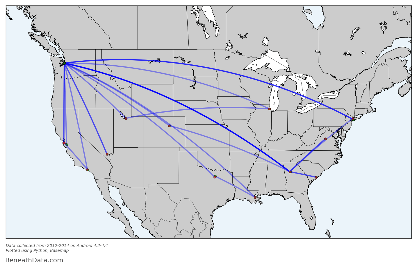
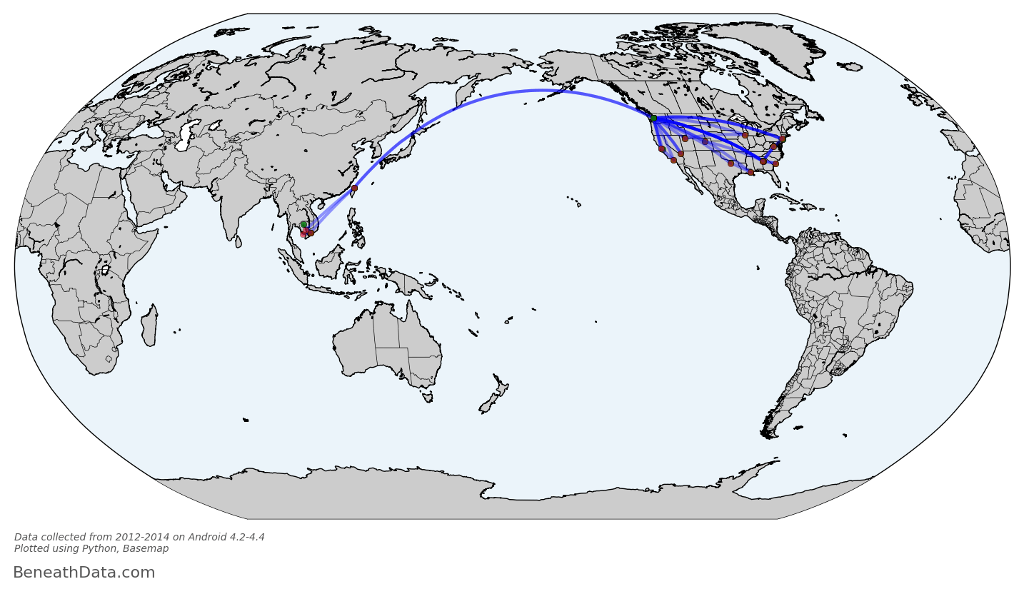
Perfect! I realize this graph probably isn't intrinsically interesting to anybody - who cares about my flight history? - but for me, I can draw a lot of fun conclusions. You can see some popular layover locations, all those lines in/out of Seattle, plus a recent trip to southeast Asia. And Basemap has made it so simple for us - no Shapefiles to import because all that map info is baked into to the Basemap module. I can even calculate all the skymiles I should have earned with a single line of code:
flights.distance.sum()
53,000 miles. If only I had loyalty to any one airline!
Wrapup
You've now got the code to go ahead and reproduce these maps. But you also have the tools to go so much further! Figure out where you usually go on the weekends; calculate your fastest commute route; measure the amount of time you spend driving vs. walking.9 While these questions may be for another blog post, they'll still be using the same tools you've seen here and nothing more. And that's pretty amazing.
Footnotes
- Edited 11/21/14 to reflect that Google Location history is available on Android or iOS ↩
- If someone knows of a way, please, let me know! ↩
- Which is already so simple to work with! ↩
- It's got bindings to GEOS, the engine that will perform a lot of the computation, and a clean syntax. ↩
- quoted from http://en.wikipedia.org/wiki/Choropleth_map ↩
- Of course, if this doesn't hold true, you can still convert to time. You'll just have to actually compute time differences. Something like
myseries.diff().sum()should be a good start ↩ - YES, I realize that using this methodology, 2 data points would be calculated as 2 minutes, when possibly I only spent 1 minute there and caught the tail ends in multiple GPS snapshots. So my estimates of time may be slightly elevated. But the tradeoff for solving this problem is miniscule. ↩
- Part of the algo that I like the least centers around finding runs of consecutive numbers (e.g. 3, 4, or 8, 9, 10). Turns out, that's actually harder than it looks. I ended up going down a stackoverflow rabbit hole trying to optimize that search algorithm and, in the end, stuck with the first thing I came up with. ↩
- I can guarantee you Google is already asking these questions of your data ↩
Comments
comments powered by Disqus