Email is a window to the soul. OK, nobody has actually ever said that, but email is at the very least a permanent log of our daily lives. In fact, I'd argue that out of all the digital interaction we take part in, email is the most honest representation of our actual behavior. Phone calls are too sparse. Text messages capture only a subset of my closest contacts. But email...everybody emails.
So, I was curious what email could tell me about my daily habits and, naturally, I turned to Python and Pandas. This blog will be about exploring the uniquely dense dataset that is your email history and, more seriously, about taking ownership of your own data. Trust me, Google is learning tons about you from your email history already. Why shouldn't you?
You'll need a few basic python packages to follow this tutorial, namely numpy, matplotlib and pandas. If you don't already have these data analysis packages, I'd suggest taking a look at Anaconda. It's a terrific package manager in its own right and comes with all you'll need for data analysis.
All this code will be written for Python 3.x and executed in IPython. There are a few tweaks you'd need to make to get this working in 2.7, and I'll call them out where applicable.1
Here's my import list for this tutorial:
import numpy as np
import pandas as pd
import matplotlib.pyplot as plt
import matplotlib.dates as dates
import matplotlib.gridspec as gridspec
from datetime import timedelta, datetime, date

import GmailAccount # my package
Step 1: Get your emails and parse them
While this tutorial will specifically focus on accessing emails from Gmail, it should broadly apply to almost any email provider. That's because Gmail, like pretty much everybody else, supports the IMAP access protocol.
Getting email content via IMAP
IMAP is pretty straightforward. Select a mail folder, retrieve a list of email ids that match a query string, and then fetch the content of those emails by id.
Unfortunately, it's a bit tricky to do cleanly and performantly, so I've quickly abstracted a class to handle the low-level fetching and parsing for you. To follow this tutorial, copy my GmailAccount class into your project someplace, which under the hood just uses Python's imaplib and email.2 I won't be getting into any real specifics about how to best use imaplib, so feel free to dig around the class to learn more.
BEFORE YOU START: A while back, Gmail disabled basic auth (non Oauth2) access to raw IMAP. Oauth-ing into your inbox is well beyond the scope of this tutorial and I mean, this isn't an IPhone app, so I suggest you just allow less secure apps to login to your account. That way, you just need your email address and password to use IMAP. Don't forget to turn less secure access back off when you're done.
OK - let's login to Gmail and fetch metadata 'bout all our emails:
gmail = GmailAccount(username='you@gmail.com', password=password)
gmail.login()

daysback = 6000 # ~10yrs...make this whatever ya like
notsince = 0 # since now.
since = (date.today() - timedelta(daysback)).strftime("%d-%b-%Y")
before = (date.today() - timedelta(notsince)).strftime("%d-%b-%Y")

SEARCH = '(SENTSINCE {si} SENTBEFORE {bf})'.format(si=since, bf=before)
ALL_HEADERS = '(BODY.PEEK[HEADER.FIELDS (DATE TO CC FROM SUBJECT)])'

# Search and fetch emails!
received = gmail.load_parse_query(search_query=SEARCH,
                                  fetch_query=ALL_HEADERS,
                                  folder='"[Gmail]/All Mail"')
Preeeeety simple with the GmailAccount class!
Before we move on, let's quickly break down that ALL_HEADERS string. It describes the fields we're requesting from the mail server and info about how we want them. We want fields that can be found in the email header (HEADER.FIELDS). Of those fields, we just want a few (DATE TO CC FROM SUBJECT). Importantly, we want to PEEK at those emails so as to not mark any of them read and wipe out any unread counts you have in your inbox.3
Converting your emails into a DataFrame
Great! We've fetched thousands of emails (probably). But they're in an unworkable format. This is where pandas comes into play. If you've read any of my previous blogs, you'll know what a True Believer I am in pandas. There's no better way to work with data in Python and you may find you never write a for loop again.4
All we need to do is reformat our emails into a nice array of key/value pairs for pandas to load. Each email object has a _headers list containing each field we requested in our IMAP fetch query. So this function should do the trick:
def scrub_email(headers):
    # IMAP sometimes returns fields with varying capitalization. Lowercase each header name.
    return dict([(title.lower(), value) for title, value in headers])
Now load your emails into a DataFrame.
df = pd.DataFrame([scrub_email(email._headers) for email in received])
Parse RFC dates into pandas Timestamps
Luckily, the GmailAccount class took care of parsing the raw email payload into a useful format courtesy of email.parser. Try received[-1]['Subject'] and you should see the subject of the most recent email in your inbox!
A remaining problem: the date field in our emails is unusable to us. It's just a dumb string. We need to parse it into a knowledgable python object, and pandas provides us just such a class: Timestamp. Now, I have my beef with a few things about Timestamp, but it does a great job combining the functionality of a bunch of different python modules5 into one cohesive unit.
Now, if you simply wanted to work with each timestamp from the perspective of a single timezone, this would be super easy. Just df['timestamp'] = df.date.map(pd.Timestamp). Dang. Even add utc=True to convert everything to UTC. But as you'll see in the next section, I actually want timezone naive timestamps, and that gets a little trickier.
Step 2: Analysis and visualization
So now the question is: what do we want to ask of our email data?
To visualize daily email, let's break down emails by hour of the day sent or received, and plot that over time. Since there are probably tens of thousands of emails in your inbox (over 100,000 in mine), a simple scatter plot will saturate too easily. This looks like a job for a heatmap.
Prepare data
But first, we'll have to tackle that timezone naive problem I mentioned before. I want to know when I sent emails in local time. If I was in Seattle and I sent an email at 17:00 PST, I want to register that as 17:00, not 20:00 EST or 01:00 UTC. And when am on the east coast, I want 17:00 EST to register as 17:00 too, not 14:00 PST or 22:00 UTC. Problem is, pandas makes it nigh impossible to work with multiple timezones in a single Series. So we'll need to bash this problem with a datetime hammer.
# Parse date strings remaining naive across multiple timezones
def try_parse_date(d):
    try:
        ts = pd.Timestamp(d)
        # IMAP is very much not perfect...some of my emails have no timezone
        # in their date string. ¯\_(ツ)_/¯
        if ts.tz is None:
            ts = ts.tz_localize('UTC')
        # I moved from east coast to west coast in 2010, so automatically assume EST/PST
        # before/after that date.
        if ts < pd.Timestamp('2010-09-01', tz='US/Eastern'):
            ts = ts.tz_convert('US/Eastern')
        else:
            ts = ts.tz_convert('US/Pacific')
        # Here's the magic to use timezone-naive timestamps
        return pd.Timestamp(ts.to_datetime().replace(tzinfo=None))

    except:
        # If we fail, return NaN so pandas can remove this email later.
        return np.nan

df['timestamp'] = df.date.map(try_parse_date)
# Remove any emails that Timestamp was unable to parse
df = df.dropna(subset=['timestamp'])
For my dataset of 100k emails, that handled all but 72 of them, which I'm not going to lose much sleep over. Sometimes, IMAP just has dates formatted in a totally irregular way, like Thursday , 10 Dec 2009 16:28:55, +0000 GMT. Not worth the effort.
Obviously, this timezone approach above this misses a few outliers like distant vacations, but this approach is plenty accurate for my purposes. If you don't need to handle emails sent in different timezones (maybe you've never left the Eastern timezone, I dunno), then you can skip a lot of the mess and just do:
# Alternate date parse function for only one timezone
def try_parse_date(d):
    try:
        ts = pd.Timestamp(d)
        if ts.tz is None:
            ts = ts.tz_localize('UTC')
        return ts.tz_convert('Your Timezone Here')
    except:
        return np.nan
To build our heatmap, we'll need to know two things about each email
- Hour of the day the email was sent (local time)
- Year-Month in which the email was sent
Getting hour is easy:
df['hour'] = df.timestamp.map(lambda x: x.hour)
Voila. To get an email's month, we can very quickly convert any Timestamp to any particular period of time with pandas Period class.
freq = 'M' # could also be 'W' (week) or 'D' (day), but month looks nice.
df = df.set_index('timestamp', drop=False)
df.index = df.index.to_period(freq)
Fast. Simple. To see what happened, take a look at your DataFrame with tail():
In [35]: df.tail()
Out[35]:
            cc                             date
timestamp
2015-12    NaN  Thu, 31 Dec 2015 02:07:11 +0000
2015-12    NaN  Wed, 30 Dec 2015 18:12:44 -0800
2015-12    NaN  Wed, 30 Dec 2015 18:16:31 -0800
2016-01    NaN  Fri, 01 Jan 2016 18:20:06 -0800
2016-01    NaN  Sat, 02 Jan 2016 01:03:22 -0500
The Period (month) of each date is now the DataFrame index! This is actually a really critical step for a couple reasons. First, we now have super easy slicing and grouping of our data - just try selecting a particular month of interest with the ix indexer:
In [36]: df.ix[pd.Period('2015-12', 'M')]
Out[36]:
            cc                             date
timestamp
2015-12    NaN  Thu, 31 Dec 2015 02:07:11 +0000
2015-12    NaN  Wed, 30 Dec 2015 18:12:44 -0800
2015-12    NaN  Wed, 30 Dec 2015 18:16:31 -0800
...
The second reason is that by setting a series of Periods as our DataFrame index, pandas automatically the periods to a PeriodIndex array for us which is super, super performant and easy to remap to a different timezone or slice (as we saw above). As it turns out, a series of plain Periods is actually incredibly expensive to slice as broadcasting is not available.
Build heatmap DataFrame
Our email DataFrame now contains all the info we need to build our heatmap. For each month, we'll need count the number of emails received each hour of the day for each month. If that sounds like a few for loops and a lot of boilerplate code, you haven't used pandas' value_counts() before:
mindate = df.timestamp.min()
maxdate = df.timestamp.max()
pr = pd.period_range(mindate, maxdate, freq=freq)
# Initialize a new HeatMap dataframe where the indicies are actually Periods of time
# Size the frame anticipating the correct number of rows (periods) and columns (hours in a day)
hm = pd.DataFrame(np.zeros([len(pr), 24]) , index=pr)

for period in pr:
    # HERE'S where the magic happens...with pandas, when you structure your data correctly,
    # it can be so terse that you almost aren't sure the program does what it says it does...
    # For this period (month), find relevant emails and count how many emails were received in
    # each hour of the day. Takes more words to explain than to code.
    if period in df.index:
        hm.ix[period] = df.ix[[period]].hour.value_counts()

# If for some weird reason there was ever an hour period where you had no email,
# fill those NaNs with zeros.
hm.fillna(0, inplace=True)
Just to prove a point, you could actually do the above with zero for loops using groupby and pivot, but this code looks cleaner to me.
Plot heatmap using pcolor
There are a lot of ways to plot heatmaps in matplotlib, from scatter to imshow to pcolor. I like pcolor.
We already created our matrix of values, hm, and all that's left is to plot and format our axes.
### Set up figure
fig = plt.figure(figsize=(12,8))
# This will be useful laterz
gs = gridspec.GridSpec(2, 2, height_ratios=[4,1], width_ratios=[20,1],)
gs.update(wspace=0.05)

### Plot our heatmap
ax = plt.subplot(gs[0])
x = dates.date2num([p.start_time for p in pr])
t = [datetime(2000, 1, 1, h, 0, 0) for h in range(24)]
t.append(datetime(2000, 1, 2, 0, 0, 0)) # add last fencepost
y = dates.date2num(t)
cm = plt.get_cmap('Oranges')
plt.pcolor(x, y, hm.transpose().as_matrix(), cmap=cm)

### Now format our axes to be human-readable
ax.xaxis.set_major_formatter(dates.DateFormatter('%b %Y'))
ax.yaxis.set_major_formatter(dates.DateFormatter('%H:%M'))
ax.set_yticks(t[::2])
ax.set_xticks(x[::12])
ax.set_xlim([x[0], x[-1]])
ax.set_ylim([t[0], t[-1]])
ax.tick_params(axis='x', pad=14, length=10, direction='inout')

### pcolor makes it sooo easy to add a color bar!
plt.colorbar(cax=plt.subplot(gs[1]))
While we're at it, let's add a line plot of total emails received per month below the heatmap. Very easy.
ax2 = plt.subplot(gs[2])
total_email = df.groupby(level=0).hour.count()
plt.plot_date(total_email.index, total_email, '-', linewidth=1.5, color=cm(0.999))
ax2.fill_between(total_email.index, 0, total_email, color=cm(0.5))

ax2.xaxis.tick_top()
out = ax2.set_xticks(total_email.index[::12])
out = ax2.xaxis.set_ticklabels([])
ax2.tick_params(axis='x', pad=14, length=10, direction='inout')
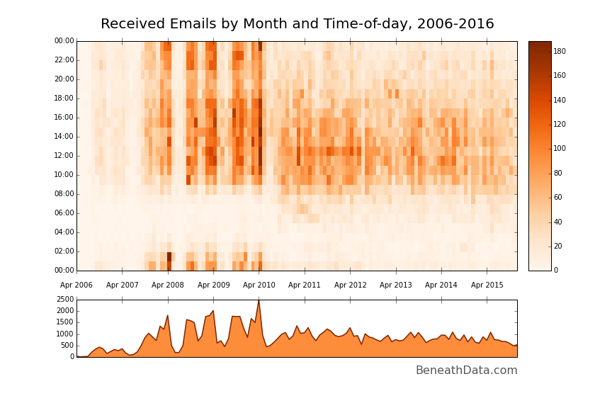
It's a solid visualization method. Immediately, a bunch of patterns jump out at you that fit with my life experience. ~Four giant vertical bands in the late aughts - my four years of college - with white bands in between (summers, when I hardly emailed anyone). The midnight - 2am band is also very easily visible during college and you can quickly pick out my changing sleep habits as I transition from college to grad school to a 9-5 job. Cool!
Let's do the exact same thing for our sent mail - all we need to do is change the inbox selection from [Gmail]/All Mail to [Gmail]/Sent Mail. I also changed the colormap from Oranges to Blues.
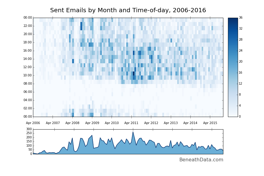
A similar but slightly different story. You can totally see my wakeup time gradually slide earlier and earlier. A lot fewer post-midnight emails...ah, the joys of getting older.
You can find the all the code used so far as a Gist here.
Step 3: Go further
I'd say we accomplished what we set out to do with our emails. But there's a million more things we can learn from this dataset. Let's try a couple quick ones.
Monthly distinct contacts
The heatamps we made show pretty clearly that the amount of email I send and receive has been steadily declining for the past few years (at least in my personal account). But, has the number of people I contact been decreasing, too? This should be a piece of cake with nunique:
# Save off your sent and received email DataFrames separately first (received_df and sent_df)
# Group by your index (Months, remember)
r = received_df.groupby(level=0)
s = sent_df.groupby(level=0)
ax = r['from'].nunique().plot(color=plt.get_cmap('Oranges')(0.999), label='From')
ax = s['to'].nunique().plot(color=plt.get_cmap('Blues')(0.999), label='Sent')
plt.title('Number of unique email contacts by month')
plt.legend()
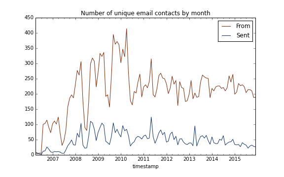
To my surprise, the number of people emailing me has held preeety steady over the last 5 years. However, I've been gradually emailing fewer and fewer people. I wonder if I've filled that gap with texting and Snapchat...
But of course, this analysis doesn't include people I've cc'd. To do that, we'd have to parse the cc string in to an array, expand it, etc., but that's probably for another blog.6
Most frequently contacted
Another great question: who do I contact the most, and who contacts me? Now that's an easy question to answer:
df['from'].value_counts().head()
However, this method has a few legitimate problems - it treats each name + email as unique when the same person could have any number of email addresses. Without solving the problem of unifying different name formats (Bob Smith, Bob J. Smith, Robert Smith), we can at least count by name and ignore different email addresses.7
def clean_name(fromname):
    return fromname.split('<')[0].strip().replace('"', '').replace('\n', '')

df['from_name'] = df['from'].map(clean_name)
df['from_name'].value_counts()[:6]
Out[105]:
Jennifer Lundstrem     2565
Michael Hartley        1708
Aaron Chevalier        1672
Jeremiah Wander        1297
Judy Hartley           1188
Bryan Nichols           813
Hi, guys!
Wrapup
Like I said, email is an incredibly descriptive dataset. There are a ton more nuggets of interest in that DataFrame above just waiting to be sussed out, and we haven't even started parsing the content of the emails yet. Who writes me the longest messages? What's my favorite curse word? Whose emails am I most and least likely to respond to? And so on.
I encourage you to take a crack at some of those analytics yourself and post any good ones in the comment section below.
Footnotes
- But you should really start using 3.x for data analysis already. It's been 8 years. Shame on you. ↩
- You could totally use this pretty decent gmail package instead of my own, but a) it hasn't been updated in years and b) it is waaaaaaay overkill for what we're doing. ↩
- Alternatively, feel free to remove
PEEKand mark all your emails as read...looking at you Mr. 8,127 unread... ↩ - There's a lot of very good reasons to not use for loops that have nothing to do with code readability and terseness. Pandas supports the incredible broadcasting ability of Numpy across the majority of its Series which means that an operation can be run performantly at the C level instead of compiled Python. ↩
- Datetime, pytz, and emailutils.parse, to name a few. ↩
- If any of you have a few liner to do it, I'd love to see it in the comments! ↩
- An optimal solution would be to leverage the Google Contacts API and merge different email addresses that way, but that's probably for another blog post. ↩
Comments
comments powered by Disqus